So I went to go see the Concordia exhibition at the National library. Two of the artists featured there were Jason Lewis and David ‘Jhave’ Johnston. The first piece that I looked at was Jason Lewis’ What They Speak to Me When They Speak To Me. I really enjoyed the interactivity of this piece. The way in which the letters are animated as they are being dragged felt really easy and natural. The web effect created by the dragging line was also a great effect. It reminded me of a processing code I found in which the web effect was more exaggerated and the user could connect one line with another.
I find along with the web affect of Jason’s piece, I would have maybe gone with a different more neutral font. I’m sure the font on its own would have seen pretty neutral but coupled with the animation of the letters, the web affect, and the vast amount of letters on the screen, the round, friendly-looking characteristics of the typeface are magnified. Also, during the time I spent experimenting with the piece, I noticed at times that it would form gibberish, other times actual words or a phrase. I felt that the interaction very much overpowered the content of the text. I found the main grasp of the piece to be the movement and action that happened on screen from my own movements rather than the meaning of the text. In fact, having went to that one first and, afterwards going to the following artists’ work, I was, in a way, disappointed in the lack of interactivity of the other works. I guess considering the way it was presented in the library atrium, having all the computer screens set up in the exact same way lead me to believe that the interaction would be on the same caliber throughout the different pieces. Considering how different each of the pieces were, perhaps it would have been more effective to present them each slightly differently in the space provided to demonstrate the range of styles of the works.
I found David Johnston’s typographical work extremely compelling. There were certain humanistic details that I just loved in the letters. The shadows that he created for the text was perfectly in sync with the movements of the words. There was one entitled death where the text would build up and break down, and then build up again from the top of a building in the distance. The tension in its movement reminded me of when an object would stick to, and break a spider web. I really admire the attention to detail and subtlety when it comes to the animated typography. I have to say that although I really like the natural movement of the type, the presentation of the type, at times, could possibly be improved upon. For example, the 3-D effect with the artificial metallic shine is something that I think the work could do without, especially on a serif typeface. The movement of the type is so organic and human so to add this unnatural, computerized quality of an effect seems unnecessary.Also, having this computerized quality of text against a real life video really brings out the artificial aspect of the type. However, I do find that in some places the 3-D of the type works well with the video. For the work titled,feel, there is a lot of attention paid to the surface of the 3-D letters. I find that the 3-D aspect of the lettering works best when the material shown to make up the letter looks authentic.
Tuesday, November 16, 2010
Tuesday, November 2, 2010
Db3 Interactive Typography (part1 b)
The second example I chose is called ‘TypeDrawing’ created by storyabout.net. There were a few variations I found of this sort of project, where the user is creating/ drawing a pictorial image using only type. Many of the examples that I found were pretty basic, and pretty much equal out to a basic version of Adobe Illustrator. With this work, there is more of an emphasis on the process in which you create the work rather than the final work. With ‘Type Drawing’ the user inserts a body of text and to be used by the program.They are able to choose which typeface is used and the scale of the grey. The aspect that I enjoy the most about this work is that the user is able to manipulate the scale of the type with the speed in which they draw on the surface area provided. Through experimentation, I have seen that this creates great depth to the letters that appear on the screen. A final aspect that I think is worth mentioning is the archive that or gallery that is also featured on the project site. There, we are able to view and comment on the works of others that are not just presented, but played over an instance of time.


Db3 Interactive Typography (part1 a)
One of the two works that I chose was a project by Levi Hammett called Dairy. Essentially, the user would type in whatever type they would prefer and each letter would appear in the beige blocks through either a quickly played real time or stop motion video of person(s) bringing in these dairy crates to physically build your letter. It is time so that each letter appears and disappears at different instances. The user is able to manipulate how many columns and rows of blocks they desire on the interface as well as the size of each block. They are also able to control the time in which each letter stays on the screen.
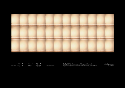


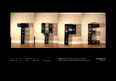
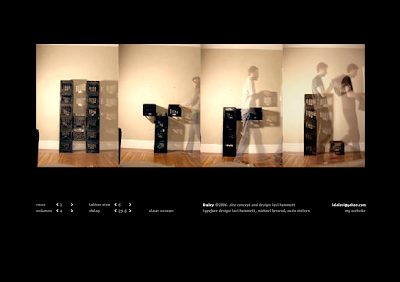
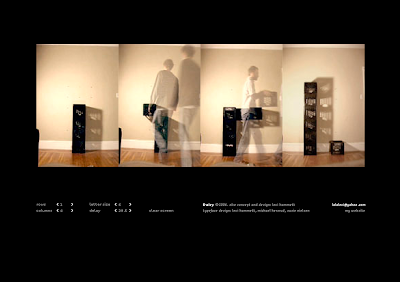
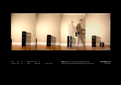

I think it is an interesting idea and it is a great milieu in interactive typography between the analogue and digital. Although it is not something that could occupy the user’s attention for a very long time, it still is very intriguing. Having looked at some of his other work, it seems as though some of his other projects seem to involve more profound concepts such as the investigation of identity through imagery and text. However, there is an honest quality of this interactive work that appeals to me. Considering the simplicity of the work, it is easy to develop curiosity of certain choices that he made (assuming they were intentional) to certain details. For example, for the letter ‘K’ he chose to leave someone standing in the shot for the last frame. And for some of the letters, there is an object cropped off on the left side. Perhaps these touches were left in to give the work more of a humanistic quality. I find the fact that not all the letters are framed the same ads variation and making the piece more appealing.


Reading Response #1
Reading response to Spiekermann, Chapter 3 Looking at Type
Upon reading the text, I really did enjoy Spiekermann’s passion for the symbolism and evocation that well designed typography induces. What I might have to question in his writing is the need for the type to express the meaning of the word in such a literal way. This could possibly lead to bad font choices and examples of kitch commercialization. There are many horrible expressive fonts out there, and perhaps it is because of the misconception that many have that the typeface of a word must bleed the characteristics of that word, to the point of being harshly stereotypical. If incorporated well into its surroundings, the word ‘surprise’ might work just as well in Garamond than in some garish font that screams the need to be surrounded by confetti. And personally, I find that classifying a word into distinct categories of how it should be presented is a bit extreme considering how subjective the whole thing is. There is no rule etched in stone that says words must wear their heart on their sleeve in order to be successful in communication. For instance, there is much debate over the appeal of the font Helvetica. You might be able to consider to one of the most neutral fonts to date in existence. Although opinions vary from one extreme to another (David Carson and Massimo Vignelli) there is no doubt that it is one of the most widely used and praised typefaces. To say that ‘Surprise’ would be better suited in a handwritten font like mistral (as suggested in Speikerman’s text) than in, lets say, Helvetica Light is completely a matter of taste and opinion.
 and it works!
Tuesday, October 12, 2010
Kinetic typography
It was difficult to narrow down my choices for favorite use of animated typography. I chose 'Stranger Than Fiction' by MK12. The way that the type's movements are exactly in sync with Will Farrell is great. It is subtle how the type and appears and disappears from the screen which helps it to incorporate well into the video. And there is a wide variation of different techniques in which the text appears and disappears which never leads the animation to be repetitive or monotonous. I also find that the coloring of the type works well with the stark atmosphere of the opening sequence, especially against the coloring of the walls seen below. And having the animation of the graphics so complex with a wide range of movement, I think the choice of a neutral font was really suitable. The graphics are great, the tie sequence especially. It looks so natural when the white graphics light of the pattern in his tie, and its a great contrast to the few seconds before where you see the pins pop out with the numbers attached (bold vs subtle). The appearance of the fibonacci grid is great too; it works well with the theme.

link to video
Wednesday, September 29, 2010
Jenny Holzer Visit
So we went to the Jenny Holzer exhibition at the DHC gallery. A major part of the subject matter of the work (with exception to the two light installation pieces dedicated to her own writings) was based on violence, and warfare. It was interesting to compare the outcome of the use of the two very different mediums. When comparing that of the LED installations to the more subdued works like the 'Redaction Paintings', it seems to go rfom one extreme to the other. Although though I find both affective, I find that the way they communicate Jenny's message is through two very different tactics.
When looking at the 'Redaction Paintings', we sort of take on the role of the outside observer. Suitable that the material used in this piece being a map, the work evokes a sense of irony and incongruity. There seems to be a paradox in the means that the visuals are so basic and simple, coming across as benign and commonplace, almost friendly. But in actuality, the meaning or purpose for the plan/map is somewhere on the other end of the spectrum. So we are seeing and judging the subject matter from a distance, much like the aerial view of the image.
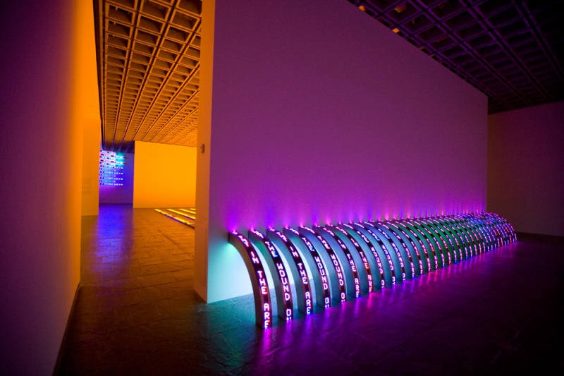
When comparing the 'Redaction Paintings' to the installation piece, 'Thorax', the viewer's perspective drastically changes. In the 'Redaction Paintings', we are persuaded to have the outsider's perspective, away from the imediacy of the issue under scrutiny. But in 'Thorax', with the use of the medium, I feel that we are put right in the middle, closer to the view of either the perperator or the victim. With the use of the bright flashing lights, in the dark, small room, along with attempting to read and understand the message displayed by the LEDs, are senses are hit with the effects of the lights, which at least for me, evoked a lot of tension, and anxiety, as well as immediacy. Considering the strong effect it had on my senses, and how it made me feel, it made me think of some severe interegation conditions or the stress and angst of those who are connected to the subject matter. This definitely affected the way I enterpreted the message on display.
When looking at the 'Redaction Paintings', we sort of take on the role of the outside observer. Suitable that the material used in this piece being a map, the work evokes a sense of irony and incongruity. There seems to be a paradox in the means that the visuals are so basic and simple, coming across as benign and commonplace, almost friendly. But in actuality, the meaning or purpose for the plan/map is somewhere on the other end of the spectrum. So we are seeing and judging the subject matter from a distance, much like the aerial view of the image.
When comparing the 'Redaction Paintings' to the installation piece, 'Thorax', the viewer's perspective drastically changes. In the 'Redaction Paintings', we are persuaded to have the outsider's perspective, away from the imediacy of the issue under scrutiny. But in 'Thorax', with the use of the medium, I feel that we are put right in the middle, closer to the view of either the perperator or the victim. With the use of the bright flashing lights, in the dark, small room, along with attempting to read and understand the message displayed by the LEDs, are senses are hit with the effects of the lights, which at least for me, evoked a lot of tension, and anxiety, as well as immediacy. Considering the strong effect it had on my senses, and how it made me feel, it made me think of some severe interegation conditions or the stress and angst of those who are connected to the subject matter. This definitely affected the way I enterpreted the message on display.
Ribs 2010

Subscribe to:
Posts (Atom)