From what I have taken from the site and interview explaining the ‘Screen’ project, it seems that this is a great experimentation from the realm of Virtual Reality, VR playing between the aim of creating a experience of kinetic poetry and a virtual game. I see it as a play on memory. As the text appears on the wall it is also being read to us. We take in the words of the text into our memories. As the words start to fall down the user is able to hit the words back into place, back onto the walls of the ‘cave’. Then the playing aspect begins as the user races to save the individual words from falling away from the text composition. What is great about this project is that the user is physically hitting the words, transforming the text into these tangible object. The Cave might represent the user’s memory and as the words fall away, the meaning or understanding of the text is forgotten. The user can attempt to keep the text from its distortion but even in the act of preserving the text, the meaning of the written work still looses its importance or relevance to the whole piece.
Sunday, December 5, 2010
Impeach the MotherFucker
I enjoy the spirit and intention behind the project. I’m curious to know how the majority of the viewers on the street would be aware of the cause behind it when they see the guys bike by with the music. So I’m not too sure how affective it would be in reaching their audience and informing them of the reasons behind this protest. I don’t know what about the project informs them about the Kucinich legislation and anti Cheney message. I understand the immediacy of the issue in trying to stimulate an apathetic youth into taking an interest into politics. So I guess considering the lack of results when it comes to attempting to reach that audience to take an interest and vote, any attempt is a descent one.
Letterscapes/Wordscapes
I first had tried the link to letterscape and then I had read about how the interaction was initially supposed to be. I find that to probably give it a fair critique I would have to experience the actual interaction because the interaction changes the whole purpose and effect of the project. The one that I had tried out which was a mouse-based interaction was interesting in the aspect of exploring a mini library of different animations and triggered by mouse navigation. I’m not sure if there was a meaning or reason for the choice of each animation attached to the letter and the same thing can be said for the wordscape.
Bolter. “Seeing and Writing”
I find Bolter’s Seeing and Writing to be discussing somewhat of the same issues that were briefly mentioned in the Ambition/Fear article of the changes and evolution of the perception and action of reading and writing from the effects of new technology. However, I find that Bolter’s writing tends to be a bit biased when it comes to assessing the values and realistic potential of the new medias whether they be positive or negative. And also when comparing the text being created and used in computer space to its prior tangible print space, I find comparison to be a bit unfair to the older technologies, and the product of printing.
I do find it interesting how through the capabilities of new media and technology, we are able to create a nostalgia for the old techniques and values of earlier traditions as a reaction against that same technology they are using; like William Morris’ techniques for production and the computer-based creation of a typeface using mathematical formulas and geometric. But there are areas of the text that seem to over generalise leave me in need of further explanation. For instance Bolter says “Typographers and graphic designers who complain about the mess their naive users make on their terminal screens are themselves children of a different technology and are apt to judge the computer’s writing and drawing space in the wrong terms.” He also goes on to say that “Typography in print begins with the letter and never goes much further.” He seems to limit the the creative forces behind print material (publications more so than magazines and ads) for the sake of his argument without the proper defence to back it up.
Vanderlans and Licko. "Ambition, Fear"
The article Ambition and Fear by Zuzana Licko and Rudy VanderLans talks of the pros and cons of the utilisation digital technology in a designer’s world. With the many new opportunities provided by these new technologies with the crossings of disciplines and evolving capabilities, there comes also many problematic issues of having too many choices and too much access. I found it interesting to consider that so many of the designers that we look up to as being icons and masters of the field either struggle with incorporating the use of these new technologies into their process, while we as a generation of designers have become somewhat dependant or have taken for granted the ability to create such massive quantities and with such speed through the aid of digital technology. And with the ability to cross over into different branches of design such as editing, composing, from sound to video to still graphics, one could say that the emphasis has changed from the quality of product and knowledge to quantity and variation of product and knowledge.
Type in Motion: Innovations in Digital Graphics
The reading from Type in Motion: Innovations in Design Graphics was an analysis of some of the title sequence, and animated logo work of Saul Bass. This reading along with the portion of the course devoted to the subject matter of title sequences I found extremely interesting. It is a part of the field of graphic design that I really hope to be able to persue. I think I like the idea of creating a treatment that is not reflective of the text but of the theme and inner workings of a film. The reading brought attention to Saul Bass’s earlier works like the title sequence of Vertigo and Nine Hours to Rama. What I found most interesting was the simple approach to the psycho sequence where through the motion and rhythm of basic forms and type help to create the tension and uneasiness that reflect the unstable and psychotic nature of the film.
The reading also features the work of animator, illustrator and designer, Pablo Ferro. His work compared to Bass is more of a Post-modern approach, with an eclectic use of techniques and styles. It was interesting to know that he originated what is called the ‘quick cut’ technique, a style of composing and editing type, video and imagery that has been adopted by many past and current designers and that is still popularly used in a lot of contemporary pop culture works.
Bringhurst. Chapter 1 The Grand Design
I find Robert Bringhurst’s The Grand Design from The Elements of Typography Style is very poetic. He uses quite a few elaborate analogies, and describes typography as an art form on its own, rather than an element that accompanies or complements something more major or essential, comparing it to a musical performance and theatrical production. He also goes into depth how it is not just an art form but also an acquired and understated skill that takes knowledge of how the treatment of the letter forms affect the other links in the formula of the whole composition. And that it is a tricky thing for typography to do its job well but not do it too well to the point where it takes center stage. It can influence, persuade, seduce and mislead. But it is shown that typography is most successful in its subtleties, and providing basic functions. Although the constraints of a typographer’s job always varies, no matter the amount of creative freedom allowed to the job, the requirements are still the same. And when the job is done correctly there is a harmony between the form and the linguistic meaning. I think that the text holds great relevance to the course in the importance of first understanding meaning and symbolism of a text and then revealing it through typographic means. And its interesting to use the comparison of a successful musical composition to a successful work of typography, implying that even the simplest formation of notes rhythm and lyrics can form such a compelling piece due to the relationship, and so the same thing can be said when working with type.
Drucker. The Visible Word
After having read the written work of Mallarme’s A Throw of the Dice, what I found most interesting was Johanna Drucker’s explanation of the inspiration for the typographical form and construction of the poem. It really became clear as to why that poem was considered an extremely important symbol for the precedence of the Avant-Garde movement.
Considering the unlimited capabilities to create typographic artwork through the ever-evolving software and technologies that our current era of the Post-modern or ‘Post post-modern, it might be hard to consider the presentation of A Throw of the Dice to be defying and bold. Currently, with the ability to manipulate so much when it comes to typography, it seems as though there are so many more variables involved. And with so many more possibilities comes so many more discussions to make as a designer of what to do and not to do. That is not to say that it is a simple task to create a successful piece by manipulating only the basic fundamentals of typography available at that time. With the innovations in dynamic and kinetic typography, its interesting to see how far we have come. And although at that time, the presentation of the poem was received as being that which pushes the boundaries of how to experience short literature, there are a lot of subtleties in the appearance of the poem that often get overlooked in a lot of the work today.
Tuesday, November 16, 2010
BanQ visit
I find along with the web affect of Jason’s piece, I would have maybe gone with a different more neutral font. I’m sure the font on its own would have seen pretty neutral but coupled with the animation of the letters, the web affect, and the vast amount of letters on the screen, the round, friendly-looking characteristics of the typeface are magnified. Also, during the time I spent experimenting with the piece, I noticed at times that it would form gibberish, other times actual words or a phrase. I felt that the interaction very much overpowered the content of the text. I found the main grasp of the piece to be the movement and action that happened on screen from my own movements rather than the meaning of the text. In fact, having went to that one first and, afterwards going to the following artists’ work, I was, in a way, disappointed in the lack of interactivity of the other works. I guess considering the way it was presented in the library atrium, having all the computer screens set up in the exact same way lead me to believe that the interaction would be on the same caliber throughout the different pieces. Considering how different each of the pieces were, perhaps it would have been more effective to present them each slightly differently in the space provided to demonstrate the range of styles of the works.
I found David Johnston’s typographical work extremely compelling. There were certain humanistic details that I just loved in the letters. The shadows that he created for the text was perfectly in sync with the movements of the words. There was one entitled death where the text would build up and break down, and then build up again from the top of a building in the distance. The tension in its movement reminded me of when an object would stick to, and break a spider web. I really admire the attention to detail and subtlety when it comes to the animated typography. I have to say that although I really like the natural movement of the type, the presentation of the type, at times, could possibly be improved upon. For example, the 3-D effect with the artificial metallic shine is something that I think the work could do without, especially on a serif typeface. The movement of the type is so organic and human so to add this unnatural, computerized quality of an effect seems unnecessary.Also, having this computerized quality of text against a real life video really brings out the artificial aspect of the type. However, I do find that in some places the 3-D of the type works well with the video. For the work titled,feel, there is a lot of attention paid to the surface of the 3-D letters. I find that the 3-D aspect of the lettering works best when the material shown to make up the letter looks authentic.
Tuesday, November 2, 2010
Db3 Interactive Typography (part1 b)
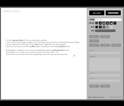
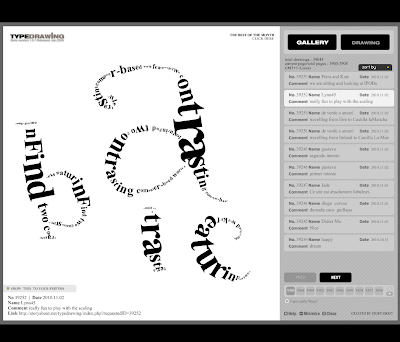
The second example I chose is called ‘TypeDrawing’ created by storyabout.net. There were a few variations I found of this sort of project, where the user is creating/ drawing a pictorial image using only type. Many of the examples that I found were pretty basic, and pretty much equal out to a basic version of Adobe Illustrator. With this work, there is more of an emphasis on the process in which you create the work rather than the final work. With ‘Type Drawing’ the user inserts a body of text and to be used by the program.They are able to choose which typeface is used and the scale of the grey. The aspect that I enjoy the most about this work is that the user is able to manipulate the scale of the type with the speed in which they draw on the surface area provided. Through experimentation, I have seen that this creates great depth to the letters that appear on the screen. A final aspect that I think is worth mentioning is the archive that or gallery that is also featured on the project site. There, we are able to view and comment on the works of others that are not just presented, but played over an instance of time.


Db3 Interactive Typography (part1 a)
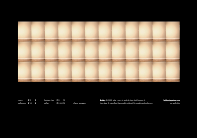
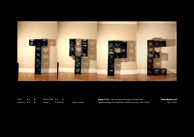
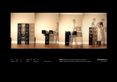
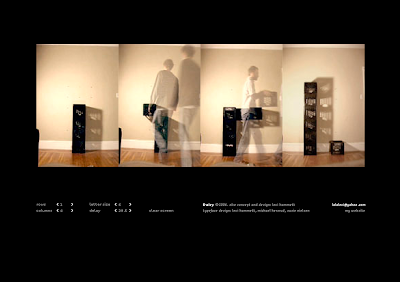
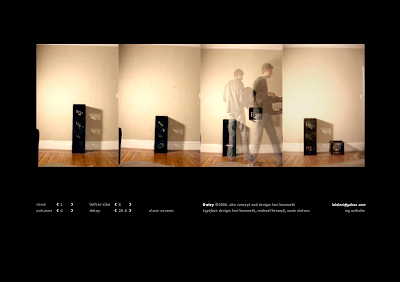
I think it is an interesting idea and it is a great milieu in interactive typography between the analogue and digital. Although it is not something that could occupy the user’s attention for a very long time, it still is very intriguing. Having looked at some of his other work, it seems as though some of his other projects seem to involve more profound concepts such as the investigation of identity through imagery and text. However, there is an honest quality of this interactive work that appeals to me. Considering the simplicity of the work, it is easy to develop curiosity of certain choices that he made (assuming they were intentional) to certain details. For example, for the letter ‘K’ he chose to leave someone standing in the shot for the last frame. And for some of the letters, there is an object cropped off on the left side. Perhaps these touches were left in to give the work more of a humanistic quality. I find the fact that not all the letters are framed the same ads variation and making the piece more appealing.



Reading Response #1
Upon reading the text, I really did enjoy Spiekermann’s passion for the symbolism and evocation that well designed typography induces. What I might have to question in his writing is the need for the type to express the meaning of the word in such a literal way. This could possibly lead to bad font choices and examples of kitch commercialization. There are many horrible expressive fonts out there, and perhaps it is because of the misconception that many have that the typeface of a word must bleed the characteristics of that word, to the point of being harshly stereotypical. If incorporated well into its surroundings, the word ‘surprise’ might work just as well in Garamond than in some garish font that screams the need to be surrounded by confetti. And personally, I find that classifying a word into distinct categories of how it should be presented is a bit extreme considering how subjective the whole thing is. There is no rule etched in stone that says words must wear their heart on their sleeve in order to be successful in communication. For instance, there is much debate over the appeal of the font Helvetica. You might be able to consider to one of the most neutral fonts to date in existence. Although opinions vary from one extreme to another (David Carson and Massimo Vignelli) there is no doubt that it is one of the most widely used and praised typefaces. To say that ‘Surprise’ would be better suited in a handwritten font like mistral (as suggested in Speikerman’s text) than in, lets say, Helvetica Light is completely a matter of taste and opinion.
Tuesday, October 12, 2010
Kinetic typography
It was difficult to narrow down my choices for favorite use of animated typography. I chose 'Stranger Than Fiction' by MK12. The way that the type's movements are exactly in sync with Will Farrell is great. It is subtle how the type and appears and disappears from the screen which helps it to incorporate well into the video. And there is a wide variation of different techniques in which the text appears and disappears which never leads the animation to be repetitive or monotonous. I also find that the coloring of the type works well with the stark atmosphere of the opening sequence, especially against the coloring of the walls seen below. And having the animation of the graphics so complex with a wide range of movement, I think the choice of a neutral font was really suitable. The graphics are great, the tie sequence especially. It looks so natural when the white graphics light of the pattern in his tie, and its a great contrast to the few seconds before where you see the pins pop out with the numbers attached (bold vs subtle). The appearance of the fibonacci grid is great too; it works well with the theme.

link to video
Wednesday, September 29, 2010
Jenny Holzer Visit
When looking at the 'Redaction Paintings', we sort of take on the role of the outside observer. Suitable that the material used in this piece being a map, the work evokes a sense of irony and incongruity. There seems to be a paradox in the means that the visuals are so basic and simple, coming across as benign and commonplace, almost friendly. But in actuality, the meaning or purpose for the plan/map is somewhere on the other end of the spectrum. So we are seeing and judging the subject matter from a distance, much like the aerial view of the image.
When comparing the 'Redaction Paintings' to the installation piece, 'Thorax', the viewer's perspective drastically changes. In the 'Redaction Paintings', we are persuaded to have the outsider's perspective, away from the imediacy of the issue under scrutiny. But in 'Thorax', with the use of the medium, I feel that we are put right in the middle, closer to the view of either the perperator or the victim. With the use of the bright flashing lights, in the dark, small room, along with attempting to read and understand the message displayed by the LEDs, are senses are hit with the effects of the lights, which at least for me, evoked a lot of tension, and anxiety, as well as immediacy. Considering the strong effect it had on my senses, and how it made me feel, it made me think of some severe interegation conditions or the stress and angst of those who are connected to the subject matter. This definitely affected the way I enterpreted the message on display.
Ribs 2010
Tuesday, September 21, 2010
Tuesday, September 14, 2010
Finding Type (group work)
Considering that there are a lot of fonts out there that try and fail to recreate the humanistic quality of hand-rendered fonts, we find that this is pretty successful at that. It doesn't show that live trace quality that a lot of fonts have.
We chose this as the most despicable because of its total lack of effort when it came to creating it. We couldn’t really think of any situation in which it would be used successfully. And it sort of reminded me of really bad myspace pages from 5 or 10 years back. It's just really bad, and people who make fonts like this should have to pay a fine.

I understand that it is trying to be experimental but its definitely too much. This was chosen for its illegibility. Although some characters by themselves seem like a cool composition playing on negative and positive space, as a typeface, its so cluttered and couldn't be appropriately used.

For this typeface, I don’t find it aesthetically pleasing. It’s another attempt at trying to be experimental, but I think it fails in demonstrating creativity in the merging of lowercase and uppercase. Rather than really playing with the forms and how they can flow together, it pretty much just slapped one right on top of the other.


